SUMMARY
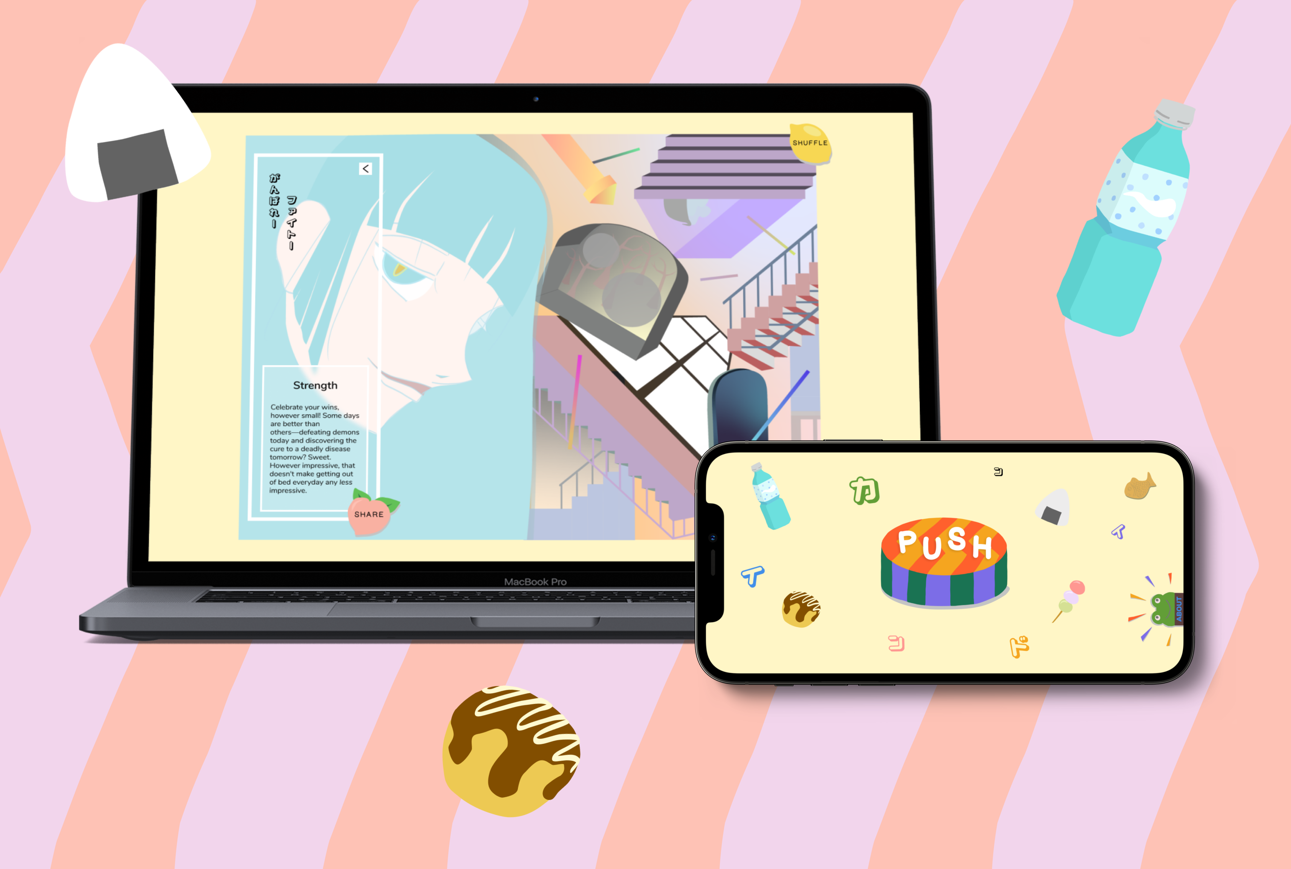
KIND is a playful digital experience that provides a gentle reminder to be kind to yourself and to encourage sharing kindness with others
Role: UI design, illustration
Key skills: UI design, illustration, wireframing
Tools: Illustrator, Photoshop, Figma
Delivery Date: July 2021
Project Duration: 6 weeks

BACKGROUND
A personal project to spread joy
In the throes of pandemic languishing and social unrest, it was easy to forget the small things that used to make us smile. Though the past few years have been challenging, I’ve been inspired by the universal kindness and resilience of people to unite and empathize, share and empower. This personal project is an exploration and expansion of that kindness we both craved and shared during these turbulent times. I hope to remind people that—particularly in difficult times like we are facing now—it is important to cherish small delights that make us happy and share kindness with the special people in our lives.
TABLE OF CONTENTS
Feel free to jump to the following sections if you are so inclined…


IDEA
A quirky upgrade of the “I’m thinking of you” text
THE PROBLEM
The pandemic made it difficult to see loved ones. We all had to adapt to digital means of communication, which certainly contributed to some quarantine blues and feelings of disconnect and loneliness.
THE SOLUTION
KIND was born from the desire to reach out to the important people in my life and let them know that I’m thinking of them—wishing them well—with a little bit more than just a text.
INSPIRATION
At this project’s inception, I discovered Monopo’s Omikuji Machine case study. Omikuji is a Japanese tradition during New Years for drawing your fortune for the year. Initially, I was drawn to the design idea—namely, turning omikuji into a digital experience. What struck me particularly was that the Monopo team created this project as a fun internal experience for its employees.

So often, products these days are suffocated with the need to have “purpose” and “deliver value.” This project was created solely for the delight of the organization, and that playful nature comes across in the art direction and design decisions (check out the gifs personalization feature).

Drawing inspiration from the Monopo project, I wondered if I could create a similar elevated digital experience to share kind thoughts with my personal network (with the added bonus of injecting a little of my personality in the design style).
01 SITE CONTENT

Words from the heart
Borrowing a page from the daily affirmations book, I wanted to share words that were warm, sensitive, and would resonate deeply with others. What thoughts would I want to hear from a close friend? Likewise, what thoughts would I want to share with a close friend? I wrote short messages for each Kind card, each centered around a theme.
Compassion
自分のペースでも良いよ
It’s ok to feel cloudy sometimes. Take a breath and remember to be kind to yourself. If you’re feeling brave, call someone you trust and share how you’re feeling. Vulnerability is powerful, and you may feel slightly less cloudy after sharing.
Joy
笑って、笑わせてしましょう
Someone somewhere is thinking fondly of you. Take a moment to think of someone you admire and recall a time that person made you smile. Now send a snap of those pearly whites to someone you care about but haven’t connected with recently.
Empathy
皆さんが愛されてほしいな
As humans, we all want to feel loved and accepted. I’m a weirdo, you’re a weirdo, and that’s a-ok. When you find it difficult to connect with another person, try to remember to respond with empathy—we’re all seeking to some degree to be accepted as our imperfect selves.
Strength
がんばれ〜 ファイト〜
Celebrate your wins, however small! Some days are better than others—defeating demons today and discovering the cure to a deadly disease tomorrow? Sweet. However impressive, that doesn’t make getting out of bed everyday any less impressive.
Courage
一歩づつ、あなたはすごい
It is ok to feel discouraged or frustrated. Obstacles can be a great learning opportunity. If you feel open to embracing a challenge, lean into discomfort and be curious about how you react and what scripts you fall back on. Be gentle and kind with your observations—you are brave to face your challenges.
Reflection
周りを見て、ゆっくり楽しんでね
Time flies by so quickly, which lends to the impression that life is fleeting. One could say life’s significance is derived from its very ephemeral nature. However, you have the power to stop and appreciate each beautiful moment in your life. Take a moment to practice being present and reflect on the beauty all around you.

02 ILLUSTRATIONS
The card designs drew inspiration from a series of different reference points. A playful nod to my time living in Japan, most of my references draw from Japanese artists or from my real-life experiences.
2.1 Satoshi Kon
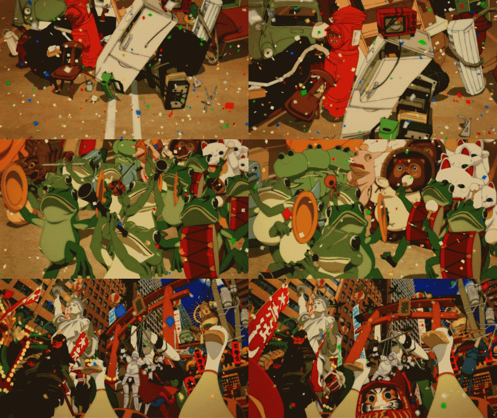
When I thought about the energy and style for the card illustrations, I immediately thought of the Japanese director and animator, Satoshi Kon. Particularly, I wanted to capture a similar chaotic energy as his film, Paprika (2006).

2.2 xxxHolic
I also was inspired heavily by the manga xxxHolic, written and illustrated by Clamp. Specifically, the dark, mysterious panels, as well as the use of shadows, lines, and shapes to create movement and space. I wanted to evoke a similar ethereal and dark-side-of-the-moon vibe.


2.3 Japan landscape + culture
Japan’s unique urban city features and robust culture also served as inspiration. Sometimes, even some real locations in Japan made an appearance in the illustrations. For example, I pulled a few references from my old haunts in Kobe for one illustration.


03 SITE DESIGN
The site was designed with no other purpose than to be a fun and whimsical experience for visitors. Its intent is to encourage users to come play, take a breath, enjoy a surprise, and perhaps share the same experience with a friend.
3.1 Site architecture
Since the site is designed to deliver a very specific experience, the site architecture and user flow is pretty simple. There are three main screens: the landing page, the card page, and a share sheet.

3.2 Wireframes
Luckily, I only designed three main screens for this site and thus was able to focus a lot of my attention on the UI. It was important to me that the experience was simple so as not to overwhelm the user with choices or distracting elements. In addition, I wanted the UI to consistently communicate playfulness, which comes through in the colorful and childish page design elements.
3.2.1 Landing page
I had a clear vision of how I wanted the landing page to behave. I started with some of the assets I created for the site, consisting of popular Japanese snacks like takoyaki (fried octopus balls) and onigiri (rice ball). I wanted these assets to move around the page almost clumsily, reminiscent of the movement of an 8-bit video game.

You take the blue pill, the story ends, you wake up in your bed and believe whatever you want to believe. You take the red pill, you stay in Wonderland, and I show you how deep the rabbit hole goes.
I considered including a brief explanation on the landing. I imagined a user stumbling upon this site with no context and was worried that a user might be reluctant to press the button without any prompt. However, after some deliberation, I decided to preserve the air of mystery. In exchange, I aimed to keep the landing page as light and inviting as possible to both reassure the user that the site is non-threatening and to pique his or her curiosity. (As a small compromise, I included an “About” pop-out tab for the risk-averse to provide an explanation about the site and information about the site contributors.)
3.2.2 Card layout
The layout of the kind cards saw several iterations. I knew I wanted a busy illustration to cover the full screen. I played around with the placement of the other elements, namely: a short phrase in Japanese (kind of like a cheer), the card message, the share button, and the logo.


I mocked up four layout options and compared them side-by-side. In the first three, it felt like the elements were floating on the page.
I liked how the fourth option had all the elements in a tight panel. It lends to a more cohesive and intentional feel—one module made of several elements on top of the illustration.

3.2.3 Share sheet
The share sheet, like the rest of the site, is intended to be playful. Ideally, if a user enjoyed the experience, he or she will share the site with someone else. On the share sheet, the user also has the option to “shuffle” the card, encouraging a continuous loop of sharing and shuffling.

3.2.4 Responsive wireframes
Although the site offers the best experience on a larger screen, it was important to me to have a responsive design that was inclusive across all devices. The layout for tablet and mobile are slightly different than desktop to accommodate a smaller screen size and the user’s viewing experience. Click on the images below to view a larger version.
Desktop


Tablet
The user is able to expand the illustrated card by rotating the screen.


Mobile
The mobile view is designed in landscape for optimal viewing.


3.3 Prototype
Focused and fun, the simple flow of the site encourages the user to click through the experience. Even when they reach the “end” of the flow, they can easily return for more by clicking the “shuffle” button.
REFLECTION

A learning opportunity to explore UI and digital illustration
This personal project was intentionally focused mostly on the UI and illustrated assets. One of the challenges with this site was bringing attention to the share-ability of the overall experience. By limiting the number of clickable buttons, the intent is to encourage a visitor to take the only available actions: share or shuffle.
In addition, in order to provide the best responsive experience for the visual e-cards, I took a different approach from the desktop version for the tablet and mobile designs. The key focal point for the responsive designs was to maximize screen space since the detail in the illustrations are more difficult to view on a smaller screen.
KIND was a design brief born from a curiosity to build a unique digital experience and, at the same time, strengthen my foundation in digital design mediums.