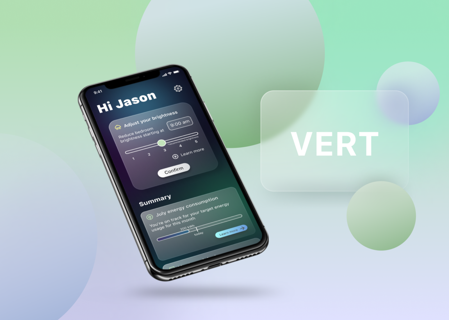
How might we help users…
- become more conscious of their consumption of environmental resources?
- leverage their smart devices to make decisions that are more environmentally conscious?
SUMMARY
VERT combines the power of Internet of Things (IoT) devices and AI to make the process of reducing a household’s carbon footprint effortless
Role: UX/UI Design
Key skills: secondary research, information architecture, prototyping
Tools: SurveyMonkey, Miro, Figma
Delivery date: September 2021
Project duration: 8 weeks
THE PROBLEM
There is undeniable evidence supporting the threat of irreversible environmental decline over the next few decades, making it even more of an imperative to act now.
Yet, despite a desire to be more more environmentally conscious, it’s difficult for a person to know where to start and how to make sense of the impact.
THE CHALLENGE
Since it is still a budding discipline, there is not much existing research that examines the precise intersection of environmental sustainability and IoT.
Thus, the greatest challenge was finding appropriate and relevant data to understand the industry landscape and inform the research and design decisions.
1 Research
1.1 Research objective
The purpose of this research is to understand the existing landscape, how people think about their energy consumption, and the way smart device owners use their devices.
1.2 Process overview
I conducted secondary research to understand the market and technology.
I looked at competitor apps to understand their strengths and weaknesses.
I used a survey to better understand user opinions and behavior.
I developed a persona for a user to design with intention for my user’s needs and pain points.
1.3 What do I need to know to understand the landscape?
| The Environment – How is energy monitored and measured? – How might we interpret energy consumption in terms of environmental impact? – What is the imperative for being environmentally conscious? | IoT Ecosystems – How does an IoT ecosystem work? – What IoT devices/technology currently exist? – What are the competitive advantages of a smart home? |
1.4 What are competitors doing well and not so well?

With a Sense monitor and sensors, users can track their home’s real-time energy activity, understand their individual consumption trends, and identify devices that drain power in their home.

Smappee provides real-time usage data and allows users to analyze their energy inputs and outputs. Smappee estimates costs and savings down to the appliance level and can automate energy activities.

Curb provides real-time home energy monitoring and prediction. Curb can recognize energy patterns and provide customized notifications to the user when it detects abnormal energy usage.

1.5 What are users saying?

Users don't understand how to be more eco-conscious consumers even if they want to be
2/3 of respondents stated they had little to no knowledge of their energy consumption habits. When asked why these users don’t monitor their energy consumption, a common thread among the reasons was lack of understanding—how to start and how to interpret the results.
– 10 respondents stated it was because they didn’t know how
– 8 respondents stated that they have never tried but it seems like too much effort to set up and maintain
– 7 respondents stated that they don’t understand what the current energy measurement metrics mean
Users are motivated to change behavior when compared to peers
When asked how energy consumption habits would change if compared to neighborhood average, 70% of respondents stated they would actively reduce their energy consumption. Interestingly, a respondent commented that his/her electricity is free, so they wouldn’t change their consumption, which implies that cost is an expected factor (as opposed to competitiveness or eco-friendliness).
Eco-conscious users' primary motivation is concern for the environment
For the 1/3 of respondents who stated they had a good understanding of their energy consumption, 70% cited care about the environment as their primary motivating factor.
Users read in-app and push notifications
40% of respondents read either the push notifications or the in-app notifications. The majority of the remaining 60% of respondents do not engage with notifications at all.
Smart devices' advantage is their convenience
Of the respondents who own smart devices, 25% stated their primary reason for using the smart device is because they like that they can control their smart device(s) from their phone. Additionally, another 25% of participants seem to believe smart devices are easier to manage than manual devices.
1.6 Let’s meet Jason
Early research revealed that the crossover of sustainability and technology resonate with younger individuals who could fall into the category of environmentalists, the cost-conscious, or tech early adopters. My persona, Jason, helped me visualize exactly who I was designing for in the next phases.

1.7 Design decisions

2 Define
Research uncovered that users want environmentally conscious consumption to be effortless. As a result, VERT’s primary focus is to enable users to immediately act on suggested adjustments to their IoT devices in as few taps as possible.
2.1 Fewer steps
It’s important to Jason to be able to take action on suggestions without having to search through the app or read unnecessary text.

2.2 Engagement made simple
Jason gets frustrated with overly complicated processes or unintelligible, unnecessary information. He prefers to see simple recommendations that are immediately actionable. I identified a few opportunities where VERT could help manage his energy usage with minimal burden.

2.3 Driving action from the dashboard
Based on users’ preferences for a simple interface that streamlines taking quick actions, it was important to have the app’s architecture support those priorities. For example, recommendations for adjusting energy consumption could be taken from the dashboard.

3 Design + Prototype
Combining the design decisions from the research with our persona in mind, the key objective for the app was to maximize usability and drive activity from the dashboard.
3.1 Streamlining dashboard usability
The dashboard went through several evolutions, with each iteration focusing on improving the usability by driving action and reducing surrounding noise.

3.1.2 Moving actions to the top
VERT’s value to its user is to make it easy to act on the suggested adjustments to consumption habits. Starting from V3, I moved the suggested actions to the top of the dashboard so they are the first thing the user sees when opening up the app.
3.1.1 Simplify the menu
I removed some options in menu from V1 that were not important to our user and only served as unnecessary options. V2 and beyond have a simplified menu with two options, enabling the user to find the information that is most important to him or her.

3.2 Managing devices made easy
The devices page also saw several changes. Each iteration focused on making it easier for our user to manage the connected devices and find a device in the app in as few clicks as possible.
3.2.1 Finding devices
In the iterations following V1, I noticed that it would be difficult to find devices without any sort of separation or search, so I focused on making connected devices easier to find by playing with layout and adding a search bar function.
I experimented with separating devices by those that are shared (like a TV in a common space) versus those that are personally managed (the lights in my bedroom). I then tried separating devices by room.


3.2.2 Managing devices
After the first few iterations, I realized that Jason and his housemates would likely have many connected devices in their smart home. If I continued with a vertical layout, it would require Jason to scroll endlessly to possibly find a device—which is not a pleasant user experience.
Instead, I decided to adjust the layout to accommodate a larger library of devices. This finding led me to rearrange the layout and shift to a horizontal scroll for devices within a room.
3.3 A flow that encourages taking action
As I began to think about the flow between wireframes, it was important that taking the actions suggested on the dashboard was a pleasing experience to get our user addicted. To prompt a small dopamine rush, each action taken triggers a small microinteraction and automatically slides out to reveal the next suggested action, enforcing the idea that it can be easy to be environmentally friendly.

3.4 Developing the UI
I chose to use glassmorphism for the UI style. I wanted to use this style since glass tiles would pair nicely with the simple app interface and layout. In addition, the indistinct background design evokes a feeling of reliability and depth, much like an elderly redwood deep in a forest.


3.4.1 Less text, more interaction
The first iteration of the UI was almost a direct copy of final wireframe. However, once the content and colors were in, it became clear that the dashboard was difficult (and a bit boring) to read. Thus the next iterations focused on further reducing unnecessary text and adding in microinteractions and visuals to improve readability.
3.5 Building a prototype with interactive components
The greatest technical challenge for the prototype was managing the screens for components with different states. For example, for a flow with one component on the screen, I needed to build two screens (to represent the on and off states). For two components, I need four screens; for three components, I need eight screens. On the screen with device details, I had at least five components, some of which had more than two states. I was able experiment with Figma’s beta interactive components to reduce the complexity and number of screens I needed to build.
Device details – TV usage
Trends module with time components


3.5.1 Take suggested actions on dashboard
This task flow is simple: confirming a suggested action on the dashboard. Learn more about the suggested actions by expanding the text. The microinteractions after each confirmation provide a small dopamine rush as the user completes actions that help save the environment.
3.5.2 Explore device details
The user can open up any device tile to learn more about his or her usage and make adjustments to the settings.
CONCLUSION
Discovery: high barriers to entry for the environmental padawan
Through the user research phase, it was surprising to discover that even if users inherently desire to be more eco-friendly, there still are many barriers to entry—challenges such as frustration with understanding environmental lingo and difficulty wading through overly technical information. In summary, no one wants to spend the time or effort reading a report in order to be an environmentally conscious agent. And often, that inertia is just enough to dissuade users from making more environmentally ethical decisions.
Lessons learned: user priorities must drive design decisions
For this project, a lot of time was invested in the discovery research phase since I had virtually no prior background knowledge in environmental sciences or IoT technology. As a result, I struggled with translating my research findings into clear design decisions. Mid-way through the project, I had to re-evaluate the wireframes because I realized I wasn’t prioritizing what’s important to my users: namely, the power to make adjustments to their energy consumption in one click. Thus, the latter design iterations focused heavily enabling user action from the dashboard and assessing design decisions based on my persona’s feelings and reactions. The final prototype has a distinctly simple UI, but it delivers from a usability standpoint because it directly reflects research and design decisions that are derived my user’s needs.